What can travel-time mapping tell us about transit?

Something that we’ve constantly advocated for is the use of travel-time mapping in decision making around transit issues.
Maps are a useful tool in transit planning. They communicate where people can go, and how they can get there. But one thing that is often missed in decisions involving public transit in Halifax is how long it will take to get there, which is why communicating travel time is so important.
Anecdotally, we all know that in Halifax there are certain places that are in accessible by transit (Burnside, Woodside, Bayers Lake, etc…). But exactly how long does it take to get to these places from certain neighbourhoods? This question is a little more difficult to answer without the use of maps.
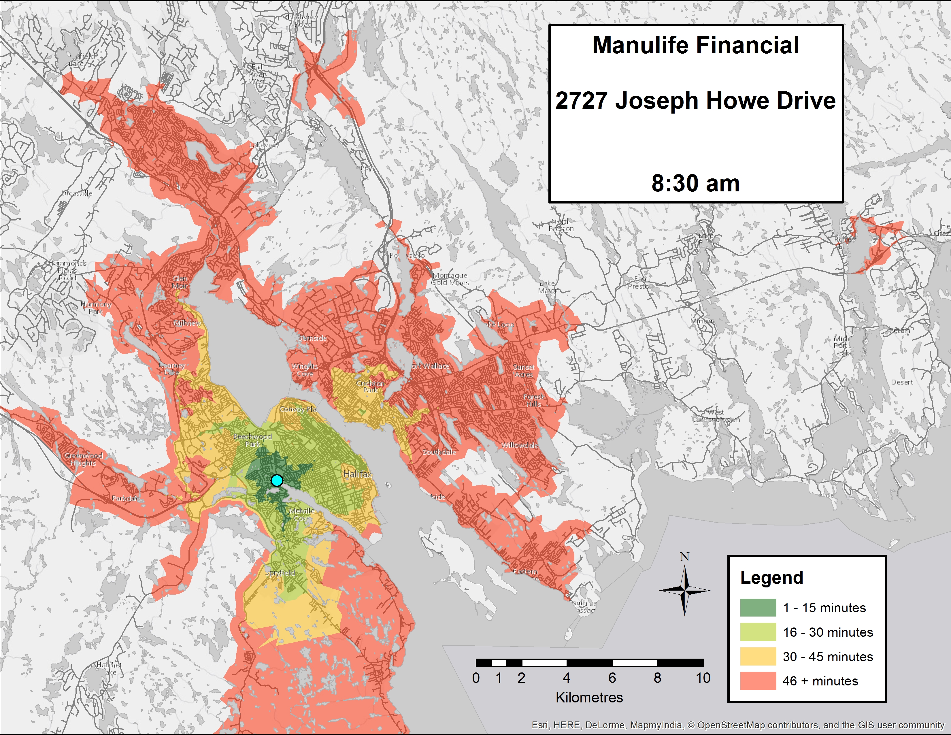
To answer it, we pulled Halifax Transit’s scheduling data and created heat maps of the time it will take riders to get to some of the major employers in Halifax. The maps are generated using schedule data during the morning peak (8:30am).
We used Halifax Transit’s current schedules, not the proposed changes in the Moving Forward Together Plan.
A note on the colour schemes:
- Dark Green (1-15 minute travel time) is generally a walk-able distance. But on some days (rain, snow, or when a rider in hurry, for example), transit would be useful.
- Light Green (16-30 minute travel time) is fairly optimal for transit use.
- Yellow (31-45 minute travel time) is where transit becomes less attractive, but still a feasible option for some trips.
- Red (46+ minute travel time) is where transit is a completely unattractive option, especially compared to driving by car. Generally, riders will not choose to take trips by transit this long if other modes can get them to their destination faster.
Scotia Square
Joe Howe/Chebucto (Manulife, Chronicle Herald, CBC)
Barrington North (Irving Shipyard, CFB Atlantic)
Burnside/Dartmouth Crossing (Halifax Regional School Board, new IKEA)
Bedford Institute of Oceanography, Canadian Coast Guard
Dartmouth General Hospital, NSCC Waterfront
IBM
Halifax International Airport
The airport is a really interesting case because of how dynamic it can be. Throughout the course of a day there are several employers changing shifts (think: airline representatives, security screeners, police, border services, restaurant workers, baggage handlers, merchandisers, cleaners, mechanics, etc….) as well as flights coming in and out, which means passengers and flight crews. Because there’s only one route that services the airport, we decided to create a second map for 8:45am.
What’s interesting is how many more places the airport is accessible from 15 minutes later in the day (granted, much of that large area, it still takes 46+ minutes to get there).
Robie, Bell, Summer, Spring Garden (QEII/IWK Health Sciences Centres, Universities)
This area has a lot of transit service. But again, we thought it would be interesting to see what it would look like two hours later during an off peak period at 10:30am.
Notice the remarkable difference in travel time during the off-peak (mainly from Bedford/Sackville). It would be safe to assume that in the off-peak midday period, travel times should actually be shorter because there’s no rush-hour traffic. However, that clearly isn’t the case here.
Some key takeaways from these travel time maps are:
- Travel-time mapping can show how long it will take to get to a destination by transit.
- A lot of focus of Halifax Transit’s current service is on the downtown core, which comes at the expense of other major employment areas.
- Frequency and time of day matter when scheduling service. Not everyone works Monday to Friday, 9am-5pm.


Very interesting. It shows a lot of flaws with the schedules. Now try it for weekend travel to various shopping districts from around the city with return times. The difference is astounding because so many routes are only hourly, connecting in reasonable times is virtually impossible.
This is a project we want to tackle, but it’s very time consuming. Stay tuned, eventually we’ll get it done.